SDS-2.2, Scalable Data Science
Million Song Dataset - Kaggle Challenge
Predict which songs a user will listen to.
SOURCE: This is just a Scala-rification of the Python notebook published in databricks community edition in 2016.
Archived YouTube video of this live unedited lab-lecture:
Stage 3: Modeling Songs via k-means

This is the third step into our project. In the first step we parsed raw text files and created a table. Then we explored different aspects of data and learned that things have been changing over time. In this step we attempt to gain deeper understanding of our data by categorizing (a.k.a. clustering) our data. For the sake of training we pick a fairly simple model based on only three parameters. We leave more sophisticated modeling as exercies to the reader
We pick the most commonly used and simplest clustering algorithm (KMeans) for our job. The SparkML KMeans implementation expects input in a vector column. Fortunately, there are already utilities in SparkML that can help us convert existing columns in our table to a vector field. It is called VectorAssembler. Here we import that functionality and use it to create a new DataFrame
// Let's quickly do everything to register the tempView of the table here

// this is a case class for our row objects
case class Song(artist_id: String, artist_latitude: Double, artist_longitude: Double, artist_location: String, artist_name: String, duration: Double, end_of_fade_in: Double, key: Int, key_confidence: Double, loudness: Double, release: String, song_hotness: Double, song_id: String, start_of_fade_out: Double, tempo: Double, time_signature: Double, time_signature_confidence: Double, title: String, year: Double, partial_sequence: Int)

def parseLine(line: String): Song = {
  // this is robust parsing by try-catching type exceptions

  def toDouble(value: String, defaultVal: Double): Double = {
    try {
       value.toDouble
    } catch {
      case e: Exception => defaultVal
    }
  }

  def toInt(value: String, defaultVal: Int): Int = {
    try {
       value.toInt
      } catch {
      case e: Exception => defaultVal
    }
  }
  // splitting the sting of each line by the delimiter TAB character '\t'
  val tokens = line.split("\t")

  // making song objects
  Song(tokens(0), toDouble(tokens(1), 0.0), toDouble(tokens(2), 0.0), tokens(3), tokens(4), toDouble(tokens(5), 0.0), toDouble(tokens(6), 0.0), toInt(tokens(7), -1), toDouble(tokens(8), 0.0), toDouble(tokens(9), 0.0), tokens(10), toDouble(tokens(11), 0.0), tokens(12), toDouble(tokens(13), 0.0), toDouble(tokens(14), 0.0), toDouble(tokens(15), 0.0), toDouble(tokens(16), 0.0), tokens(17), toDouble(tokens(18), 0.0), toInt(tokens(19), -1))
}

// this is loads all the data - a subset of the 1M songs dataset
val dataRDD = sc.textFile("/databricks-datasets/songs/data-001/part-*")

// .. fill in comment
val df = dataRDD.map(parseLine).toDF

// .. fill in comment
df.createOrReplaceTempView("songsTable")
defined class Song
parseLine: (line: String)Song
dataRDD: org.apache.spark.rdd.RDD[String] = /databricks-datasets/songs/data-001/part-* MapPartitionsRDD[14103] at textFile at <console>:65
df: org.apache.spark.sql.DataFrame = [artist_id: string, artist_latitude: double ... 18 more fields]
import org.apache.spark.ml.feature.VectorAssembler

val trainingData = new VectorAssembler()
                      .setInputCols(Array("duration", "tempo", "loudness"))
                      .setOutputCol("features")
                      .transform(table("songsTable"))
import org.apache.spark.ml.feature.VectorAssembler
trainingData: org.apache.spark.sql.DataFrame = [artist_id: string, artist_latitude: double ... 19 more fields]
All we have done above with the VectorAssembler method is:
- created a DataFrame called
trainingData - that
transformed ourtablecalledsongsTable - by adding an output column named
featuresusingsetOutputCol("features") - that was obtained from an
Arrayof thesongsTable's columns namedduration,tempoandloudnessusingsetInputCols(Array("duration", "tempo", "loudness")).
trainingData.take(3) // see first 3 rows of trainingData DataFrame, notice the vectors in the last column
res1: Array[org.apache.spark.sql.Row] = Array([AR81V6H1187FB48872,0.0,0.0,,Earl Sixteen,213.7073,0.0,11,0.419,-12.106,Soldier of Jah Army,0.0,SOVNZSZ12AB018A9B8,208.289,125.882,1.0,0.0,Rastaman,2003.0,-1,[213.7073,125.882,-12.106]], [ARVVZQP11E2835DBCB,0.0,0.0,,Wavves,133.25016,0.0,0,0.282,0.596,Wavvves,0.471578247701,SOJTQHQ12A8C143C5F,128.116,89.519,1.0,0.0,I Want To See You (And Go To The Movies),2009.0,-1,[133.25016,89.519,0.596]], [ARFG9M11187FB3BBCB,0.0,0.0,Nashua USA,C-Side,247.32689,0.0,9,0.612,-4.896,Santa Festival Compilation 2008 vol.1,0.0,SOAJSQL12AB0180501,242.196,171.278,5.0,1.0,Loose on the Dancefloor,0.0,225261,[247.32689,171.278,-4.896]])
Transformers
A Transformer is an abstraction that includes feature transformers and learned models. Technically, a Transformer implements a method transform(), which converts one DataFrame into another, generally by appending one or more columns. For example:
- A feature transformer might take a DataFrame, read a column (e.g., text), map it into a new column (e.g., feature vectors), and output a new DataFrame with the mapped column appended.
- A learning model might take a DataFrame, read the column containing feature vectors, predict the label for each feature vector, and output a new DataFrame with predicted labels appended as a column.
Estimators
An Estimator abstracts the concept of a learning algorithm or any algorithm that fits or trains on data.
Technically, an Estimator implements a method fit(), which accepts a DataFrame and produces a Model, which is a Transformer.
For example, a learning algorithm such as LogisticRegression is an Estimator, and calling fit() trains a LogisticRegressionModel, which is a Model and hence a Transformer.
display(trainingData.select("duration", "tempo", "loudness", "features").limit(5)) // see features in more detail
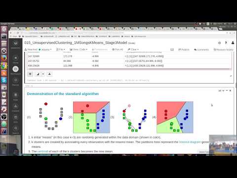
Demonstration of the standard algorithm
(1)  (2)
(2)  (3)
(3)  (4)
(4) 
k initial "means" (in this case k=3) are randomly generated within the data domain (shown in color).
k clusters are created by associating every observation with the nearest mean. The partitions here represent the Voronoi diagram generated by the means.
- The centroid of each of the k clusters becomes the new mean.
- Steps 2 and 3 are repeated until local convergence has been reached.
The "assignment" step 2 is also referred to as expectation step, the "update step" 3 as maximization step, making this algorithm a variant of the generalized expectation-maximization algorithm.
Caveats: As k-means is a heuristic algorithm, there is no guarantee that it will converge to the global optimum, and the result may depend on the initial clusters. As the algorithm is usually very fast, it is common to run it multiple times with different starting conditions. However, in the worst case, k-means can be very slow to converge. For more details see https://en.wikipedia.org/wiki/K-means_clustering that is also embedded in-place below.
CAUTION!
Iris flower data set, clustered using
- k-means (left) and
- true species in the data set (right).

k-means clustering result for the Iris flower data set and actual species visualized using ELKI. Cluster means are marked using larger, semi-transparent symbols.
Note that k-means is non-determinicstic, so results vary. Cluster means are visualized using larger, semi-transparent markers. The visualization was generated using ELKI.
With some cautionary tales we go ahead with applying k-means to our dataset next.
We can now pass this new DataFrame to the KMeans model and ask it to categorize different rows in our data to two different classes (setK(2)). We place the model in a immutable value named model.
Note: This command performs multiple spark jobs (one job per iteration in the KMeans algorithm). You will see the progress bar starting over and over again.
import org.apache.spark.ml.clustering.KMeans
val model = new KMeans().setK(2).fit(trainingData) // 37 seconds in academic shard
import org.apache.spark.ml.clustering.KMeans
model: org.apache.spark.ml.clustering.KMeansModel = kmeans_9f249c2f59db
//model. // uncomment and place cursor next to . and hit Tab to see all methods on model
model.clusterCenters // get cluster centres
res4: Array[org.apache.spark.ml.linalg.Vector] = Array([208.69376299810548,124.38624362989601,-9.986404825426284], [441.01453952597154,122.99957918634217,-10.558492553577913])
val modelTransformed = model.transform(trainingData) // to get predictions as last column
modelTransformed: org.apache.spark.sql.DataFrame = [artist_id: string, artist_latitude: double ... 20 more fields]
Remember that ML Pipelines works with DataFrames. So, our trainingData and modelTransformed are both DataFrames
trainingData.printSchema
root
 |-- artist_id: string (nullable = true)
 |-- artist_latitude: double (nullable = false)
 |-- artist_longitude: double (nullable = false)
 |-- artist_location: string (nullable = true)
 |-- artist_name: string (nullable = true)
 |-- duration: double (nullable = false)
 |-- end_of_fade_in: double (nullable = false)
 |-- key: integer (nullable = false)
 |-- key_confidence: double (nullable = false)
 |-- loudness: double (nullable = false)
 |-- release: string (nullable = true)
 |-- song_hotness: double (nullable = false)
 |-- song_id: string (nullable = true)
 |-- start_of_fade_out: double (nullable = false)
 |-- tempo: double (nullable = false)
 |-- time_signature: double (nullable = false)
 |-- time_signature_confidence: double (nullable = false)
 |-- title: string (nullable = true)
 |-- year: double (nullable = false)
 |-- partial_sequence: integer (nullable = false)
 |-- features: vector (nullable = true)
modelTransformed.printSchema
root
 |-- artist_id: string (nullable = true)
 |-- artist_latitude: double (nullable = false)
 |-- artist_longitude: double (nullable = false)
 |-- artist_location: string (nullable = true)
 |-- artist_name: string (nullable = true)
 |-- duration: double (nullable = false)
 |-- end_of_fade_in: double (nullable = false)
 |-- key: integer (nullable = false)
 |-- key_confidence: double (nullable = false)
 |-- loudness: double (nullable = false)
 |-- release: string (nullable = true)
 |-- song_hotness: double (nullable = false)
 |-- song_id: string (nullable = true)
 |-- start_of_fade_out: double (nullable = false)
 |-- tempo: double (nullable = false)
 |-- time_signature: double (nullable = false)
 |-- time_signature_confidence: double (nullable = false)
 |-- title: string (nullable = true)
 |-- year: double (nullable = false)
 |-- partial_sequence: integer (nullable = false)
 |-- features: vector (nullable = true)
 |-- prediction: integer (nullable = false)
- The column
featuresthat we specified as output column to ourVectorAssemblercontains the features - The new column
predictionin modelTransformed contains the predicted output
val transformed = modelTransformed.select("duration", "tempo", "loudness", "prediction")
transformed: org.apache.spark.sql.DataFrame = [duration: double, tempo: double ... 2 more fields]
To comfortably visualize the data we produce a random sample.
Remember the display() function? We can use it to produce a nicely rendered table of transformed DataFrame.
// just sampling the fraction 0.005 of all the rows at random,
// 'false' argument to sample is for sampling without replacement
display(transformed.sample(false, fraction = 0.005))
| duration | tempo | loudness | prediction |
|---|---|---|---|
| 182.85669 | 169.892 | -11.187 | 0.0 |
| 237.81832 | 136.563 | -12.567 | 0.0 |
| 276.08771 | 90.861 | -8.6 | 0.0 |
| 212.68853 | 150.291 | -13.745 | 0.0 |
| 290.79465 | 142.978 | -6.782 | 0.0 |
| 344.842 | 111.976 | -7.519 | 1.0 |
| 223.00689 | 68.717 | -18.321 | 0.0 |
| 152.97261 | 187.235 | -7.561 | 0.0 |
| 213.91628 | 99.348 | -17.241 | 0.0 |
| 187.6371 | 124.999 | -9.583 | 0.0 |
| 206.96771 | 145.2 | -12.813 | 0.0 |
| 421.40689 | 126.991 | -7.874 | 1.0 |
| 303.46404 | 89.991 | -8.187 | 0.0 |
| 351.9473 | 150.891 | -10.697 | 1.0 |
| 216.47628 | 119.348 | -7.16 | 0.0 |
| 90.22649 | 200.272 | -4.926 | 0.0 |
| 378.01751 | 108.918 | -15.341 | 1.0 |
| 260.07465 | 87.996 | -6.838 | 0.0 |
| 58.64444 | 89.232 | -24.717 | 0.0 |
| 289.88036 | 114.008 | -6.23 | 0.0 |
| 10.55302 | 146.206 | -21.169 | 0.0 |
| 244.13995 | 160.289 | -7.862 | 0.0 |
| 219.74159 | 104.606 | -6.568 | 0.0 |
| 279.74485 | 88.543 | -12.427 | 0.0 |
| 346.04363 | 122.183 | -11.881 | 1.0 |
| 224.96608 | 97.445 | -13.097 | 0.0 |
| 228.57098 | 88.514 | -7.858 | 0.0 |
| 83.80036 | 114.345 | -4.951 | 0.0 |
| 211.93098 | 136.122 | -14.95 | 0.0 |
| 161.30567 | 78.461 | -13.798 | 0.0 |
Truncated to 30 rows
To generate a scatter plot matrix, click on the plot button bellow the table and select scatter. That will transform your table to a scatter plot matrix. It automatically picks all numeric columns as values. To include predicted clusters, click on Plot Options and drag prediction to the list of Keys. You will get the following plot. On the diagonal panels you see the PDF of marginal distribution of each variable. Non-diagonal panels show a scatter plot between variables of the two variables of the row and column. For example the top right panel shows the scatter plot between duration and loudness. Each point is colored according to the cluster it is assigned to.
display(transformed.sample(false, fraction = 0.1)) // try fraction=1.0 as this dataset is small
| duration | tempo | loudness | prediction |
|---|---|---|---|
| 337.05751 | 84.986 | -9.092 | 1.0 |
| 156.86485 | 162.48 | -9.962 | 0.0 |
| 215.95383 | 113.745 | -6.728 | 0.0 |
| 253.33506 | 106.174 | -7.634 | 0.0 |
| 53.86404 | 102.771 | -8.348 | 0.0 |
| 244.27057 | 112.731 | -10.505 | 0.0 |
| 134.53016 | 104.155 | -9.995 | 0.0 |
| 193.07057 | 85.019 | -5.715 | 0.0 |
| 304.09098 | 90.442 | -14.1 | 0.0 |
| 104.75057 | 146.03 | -7.59 | 0.0 |
| 163.76118 | 109.509 | -11.688 | 0.0 |
| 235.78077 | 146.935 | -5.223 | 0.0 |
| 397.53098 | 85.327 | -7.938 | 1.0 |
| 257.43628 | 160.201 | -10.988 | 0.0 |
| 246.49098 | 184.146 | -2.76 | 0.0 |
| 242.36363 | 135.941 | -5.782 | 0.0 |
| 32.522 | 82.418 | -15.446 | 0.0 |
| 276.08771 | 90.861 | -8.6 | 0.0 |
| 375.77098 | 111.93 | -9.468 | 1.0 |
| 196.46649 | 35.359 | -22.812 | 0.0 |
| 207.62077 | 139.944 | -7.139 | 0.0 |
| 204.9824 | 163.894 | -9.917 | 0.0 |
| 218.56608 | 162.394 | -12.941 | 0.0 |
| 522.00444 | 80.003 | -9.412 | 1.0 |
| 263.67955 | 131.984 | -3.124 | 0.0 |
| 83.82649 | 81.845 | -21.042 | 0.0 |
| 242.85995 | 116.808 | -8.526 | 0.0 |
| 233.09016 | 81.996 | -5.243 | 0.0 |
| 230.81751 | 69.276 | -17.094 | 0.0 |
| 272.29995 | 156.958 | -14.884 | 0.0 |
Truncated to 30 rows
displayHTML(frameIt("https://en.wikipedia.org/wiki/Euclidean_space",500))
Do you see the problem in our clusters based on the plot?
As you can see there is very little "separation" (in the sense of being separable into two point clouds, that represent our two identifed clusters, such that they have minimal overlay of these two features, i.e. tempo and loudness. NOTE that this sense of "pairwise separation" is a 2D projection of all three features in 3D Euclidean Space, i.e. loudness, tempo and duration, that depends directly on their two-dimensional visually sense-making projection of perhaps two important song features, as depicted in the corresponding 2D-scatter-plot of tempo versus loudness within the 2D scatter plot matrix that is helping us to partially visualize in the 2D-plane all of the three features in the three dimensional real-valued feature space that was the input to our K-Means algorithm) between loudness, and tempo and generated clusters. To see that, focus on the panels in the first and second columns of the scatter plot matrix. For varying values of loudness and tempo prediction does not change. Instead, duration of a song alone predicts what cluster it belongs to. Why is that?
To see the reason, let's take a look at the marginal distribution of duration in the next cell.
To produce this plot, we have picked histogram from the plots menu and in Plot Options we chose prediction as key and duration as value. The histogram plot shows significant skew in duration. Basically there are a few very long songs. These data points have large leverage on the mean function (what KMeans uses for clustering).
display(transformed.sample(false, fraction = 1.0).select("duration", "prediction")) // plotting over all results
| duration | prediction |
|---|---|
| 213.7073 | 0.0 |
| 133.25016 | 0.0 |
| 247.32689 | 0.0 |
| 337.05751 | 1.0 |
| 430.23628 | 1.0 |
| 186.80118 | 0.0 |
| 361.89995 | 1.0 |
| 220.00281 | 0.0 |
| 156.86485 | 0.0 |
| 256.67873 | 0.0 |
| 204.64281 | 0.0 |
| 112.48281 | 0.0 |
| 170.39628 | 0.0 |
| 215.95383 | 0.0 |
| 303.62077 | 0.0 |
| 266.60526 | 0.0 |
| 326.19057 | 1.0 |
| 51.04281 | 0.0 |
| 129.4624 | 0.0 |
| 253.33506 | 0.0 |
| 237.76608 | 0.0 |
| 132.96281 | 0.0 |
| 399.35955 | 1.0 |
| 168.75057 | 0.0 |
| 396.042 | 1.0 |
| 192.10404 | 0.0 |
| 12.2771 | 0.0 |
| 367.56853 | 1.0 |
| 189.93587 | 0.0 |
| 233.50812 | 0.0 |
Truncated to 30 rows
There are known techniques for dealing with skewed features. A simple technique is applying a power transformation. We are going to use the simplest and most common power transformation: logarithm.
In following cell we repeat the clustering experiment with a transformed DataFrame that includes a new column called log_duration.
val df = table("songsTable").selectExpr("tempo", "loudness", "log(duration) as log_duration")
val trainingData2 = new VectorAssembler().
                  setInputCols(Array("log_duration", "tempo", "loudness")).
                  setOutputCol("features").
                  transform(df)
val model2 = new KMeans().setK(2).fit(trainingData2)
val transformed2 = model2.transform(trainingData2).select("log_duration", "tempo", "loudness", "prediction")
display(transformed2.sample(false, fraction = 0.1))
| log_duration | tempo | loudness | prediction |
|---|---|---|---|
| 5.715779455566171 | 113.924 | -11.422 | 0.0 |
| 5.128421707524712 | 149.709 | -9.086 | 1.0 |
| 5.246686488869869 | 134.957 | -12.934 | 1.0 |
| 5.700695916131519 | 130.152 | -6.552 | 1.0 |
| 5.337347484616152 | 96.006 | -8.849 | 0.0 |
| 4.290263120508892 | 100.777 | -20.277 | 0.0 |
| 5.0043102665494 | 109.267 | -7.877 | 0.0 |
| 5.630042029827832 | 114.493 | -5.989 | 0.0 |
| 6.007690245599277 | 125.022 | -11.66 | 0.0 |
| 5.717326932947787 | 90.442 | -14.1 | 0.0 |
| 4.002817550537711 | 246.365 | -8.539 | 1.0 |
| 6.115636993601915 | 137.939 | -13.916 | 1.0 |
| 5.462902432614862 | 146.935 | -5.223 | 1.0 |
| 5.274758113962512 | 160.093 | -9.8 | 1.0 |
| 4.9194948222974855 | 166.431 | -8.966 | 1.0 |
| 5.550772233170746 | 160.201 | -10.988 | 1.0 |
| 5.612071234226773 | 213.981 | -13.702 | 1.0 |
| 5.369606426442127 | 137.648 | -11.137 | 1.0 |
| 5.324324967820225 | 110.03 | -13.913 | 0.0 |
| 5.793310850788608 | 173.634 | -10.309 | 1.0 |
| 5.315376921332985 | 172.282 | -11.732 | 1.0 |
| 4.153555636431081 | 104.664 | -17.248 | 0.0 |
| 5.0481981594199565 | 111.826 | -27.174 | 0.0 |
| 5.879897616998539 | 80.011 | -20.412 | 0.0 |
| 5.584102065123898 | 115.04 | -5.609 | 0.0 |
| 5.4343579148569 | 71.071 | -6.673 | 0.0 |
| 5.403094457046498 | 115.084 | -8.535 | 0.0 |
| 5.5797743155625845 | 70.388 | -21.244 | 0.0 |
| 5.560064325136838 | 107.622 | -9.891 | 0.0 |
| 5.067467888196051 | 130.358 | -7.399 | 1.0 |
Truncated to 30 rows
The new clustering model makes much more sense. Songs with high tempo and loudness are put in one cluster and song duration does not affect song categories.
To really understand how the points in 3D behave you need to see them in 3D interactively and understand the limits of its three 2D projections. For this let us spend some time and play in sageMath Worksheet in CoCalc (it is free for light-weight use and perhaps worth the 7 USD a month if you need more serious computing in mathmeatics, statistics, etc. in multiple languages!).
Let us take a look at this sageMath Worksheet published here:
- https://cocalc.com/projects/ee9392a2-c83b-4eed-9468-767bb90fd12a/files/3DEuclideanSpace_1MSongsKMeansClustering.sagews
- and the accompanying datasets (downloaded from the
displays in this notebook and uploaded to CoCalc as CSV files):- https://cocalc.com/projects/ee9392a2-c83b-4eed-9468-767bb90fd12a/files/KMeansClusters10003DFeaturesloudness-tempologDurationOf1MSongsKMeansfor015sds2-2.csv
- https://cocalc.com/projects/ee9392a2-c83b-4eed-9468-767bb90fd12a/files/KMeansClusters10003DFeaturesloudness-tempoDurationOf1MSongsKMeansfor015sds2-2.csv
The point of the above little example is that you need to be able to tell a sensible story with your data science process and not just blindly apply a heuristic, but highly scalable, algorithm which depends on the notion of nearest neighborhoods defined by the metric (Euclidean distances in 3-dimensional real-valued spaces in this example) induced by the features you have engineered or have the power to re/re/...-engineer to increase the meaningfullness of the problem at hand.